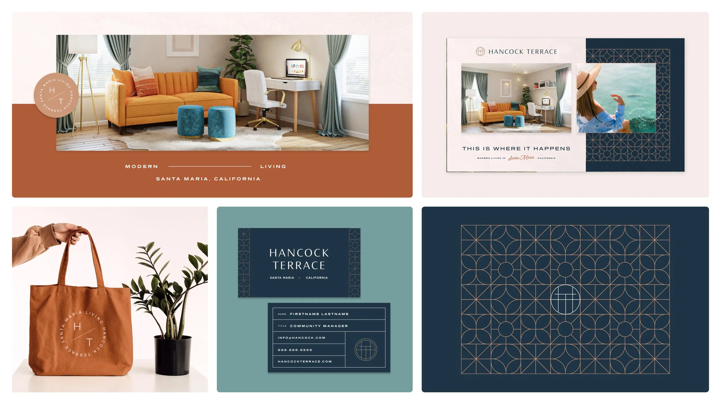
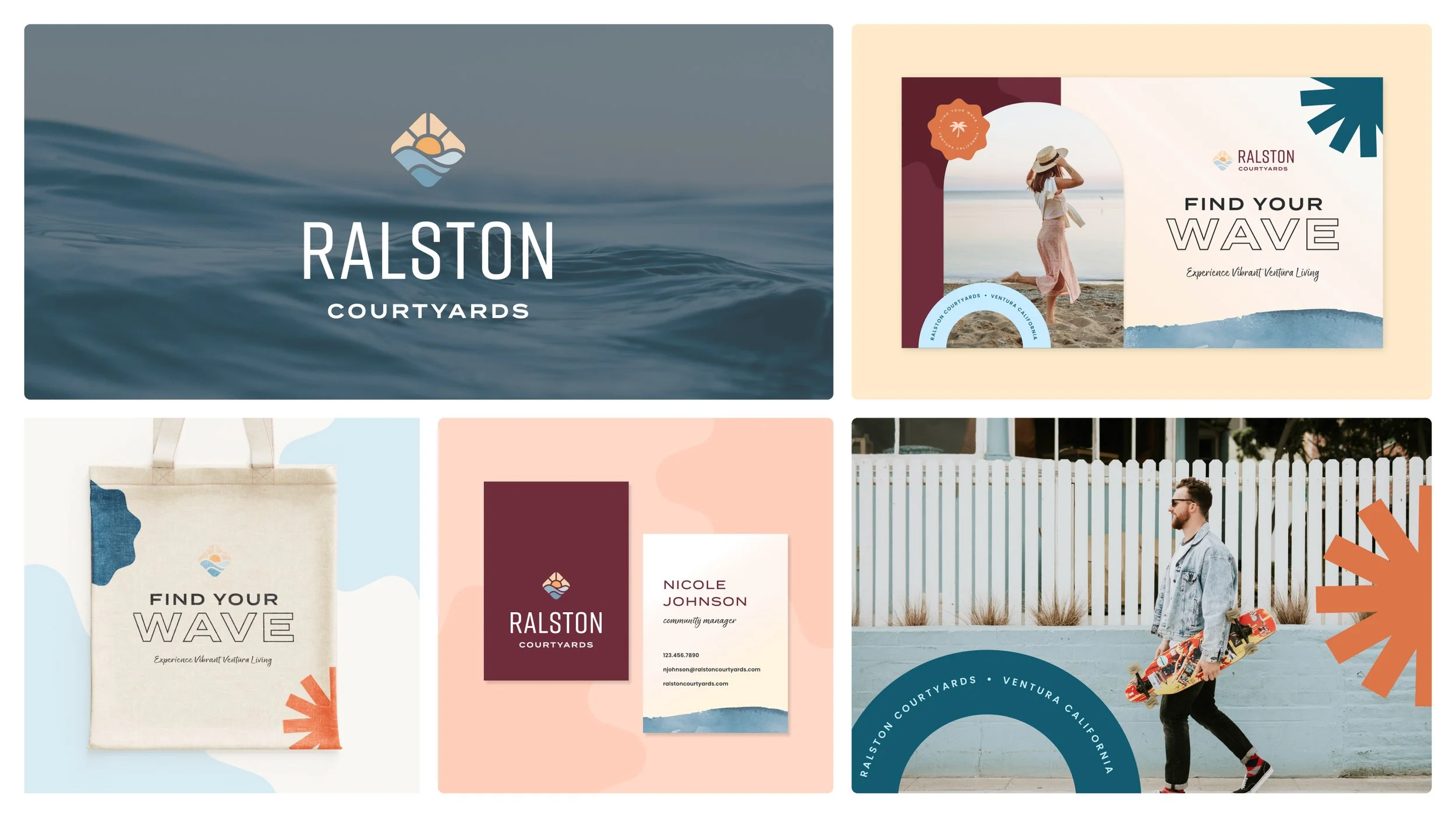
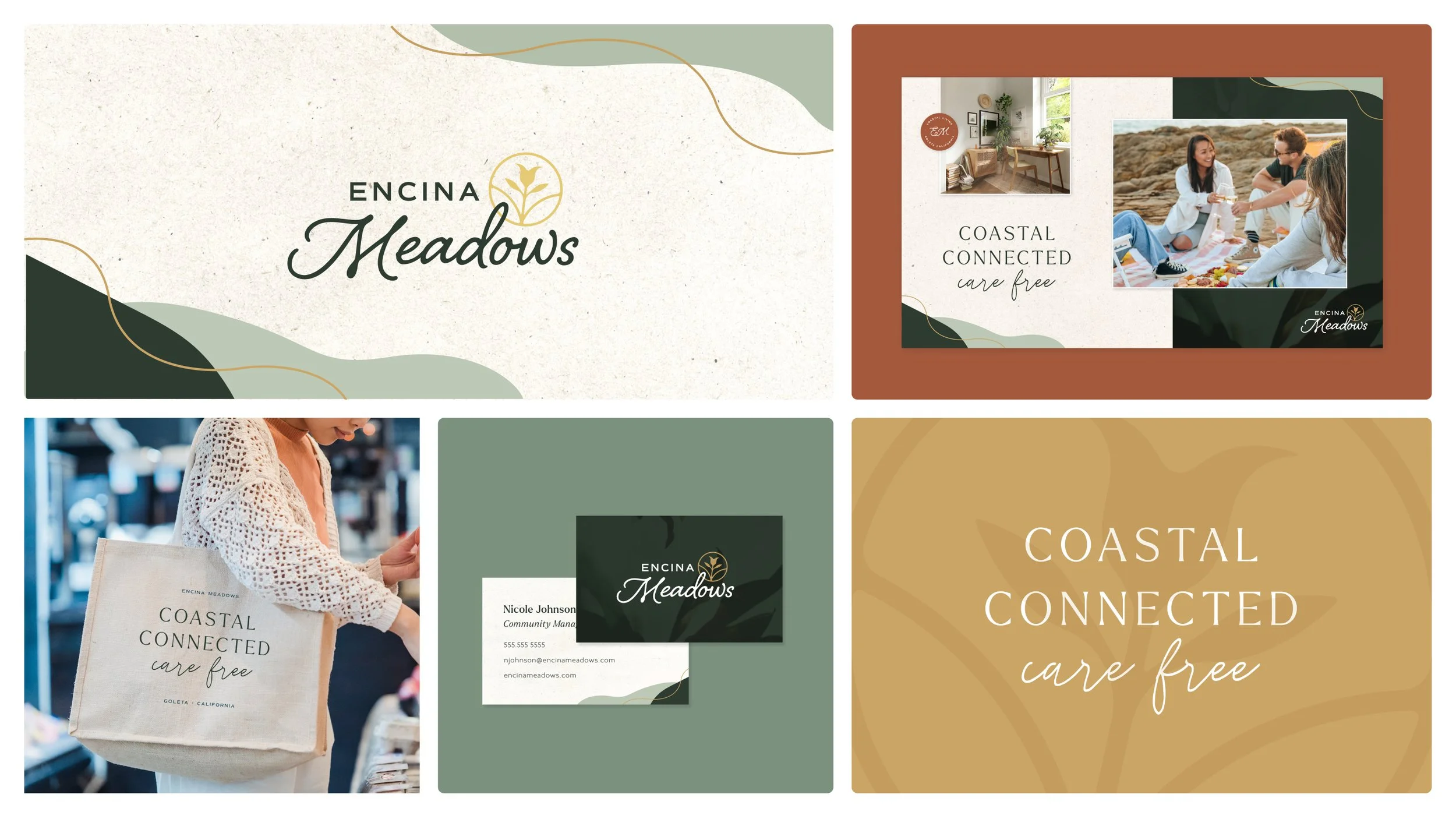
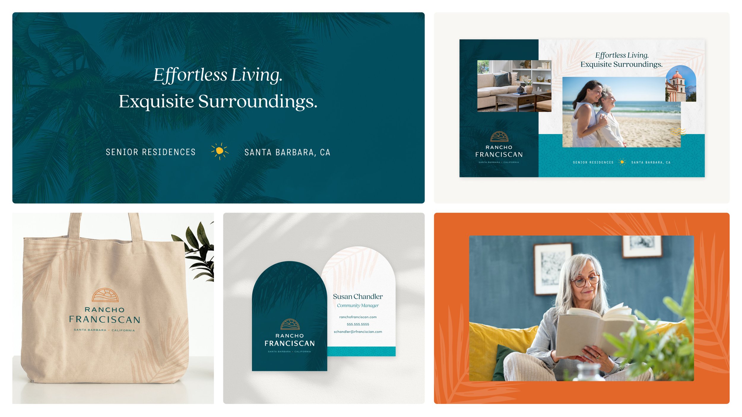
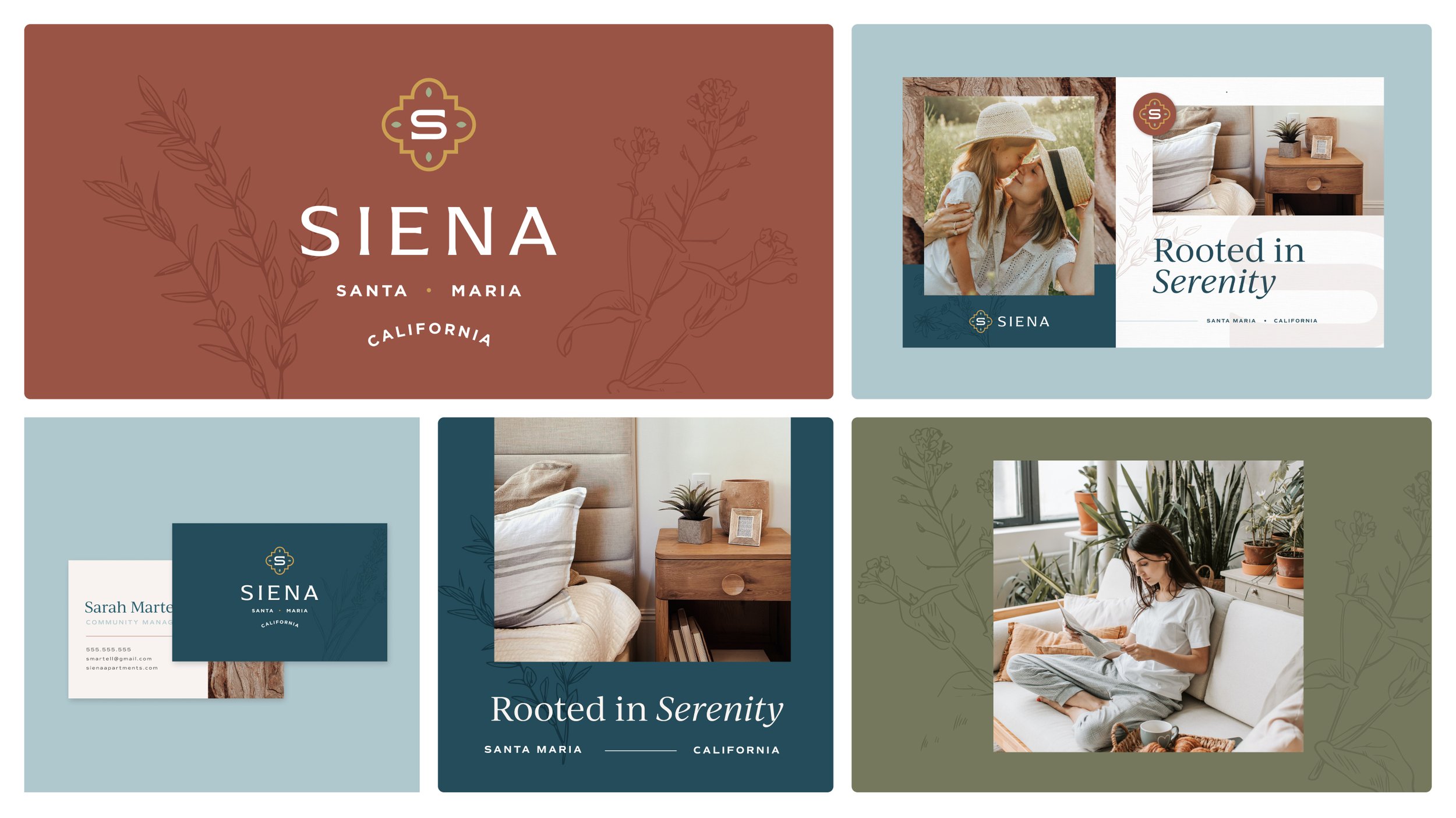
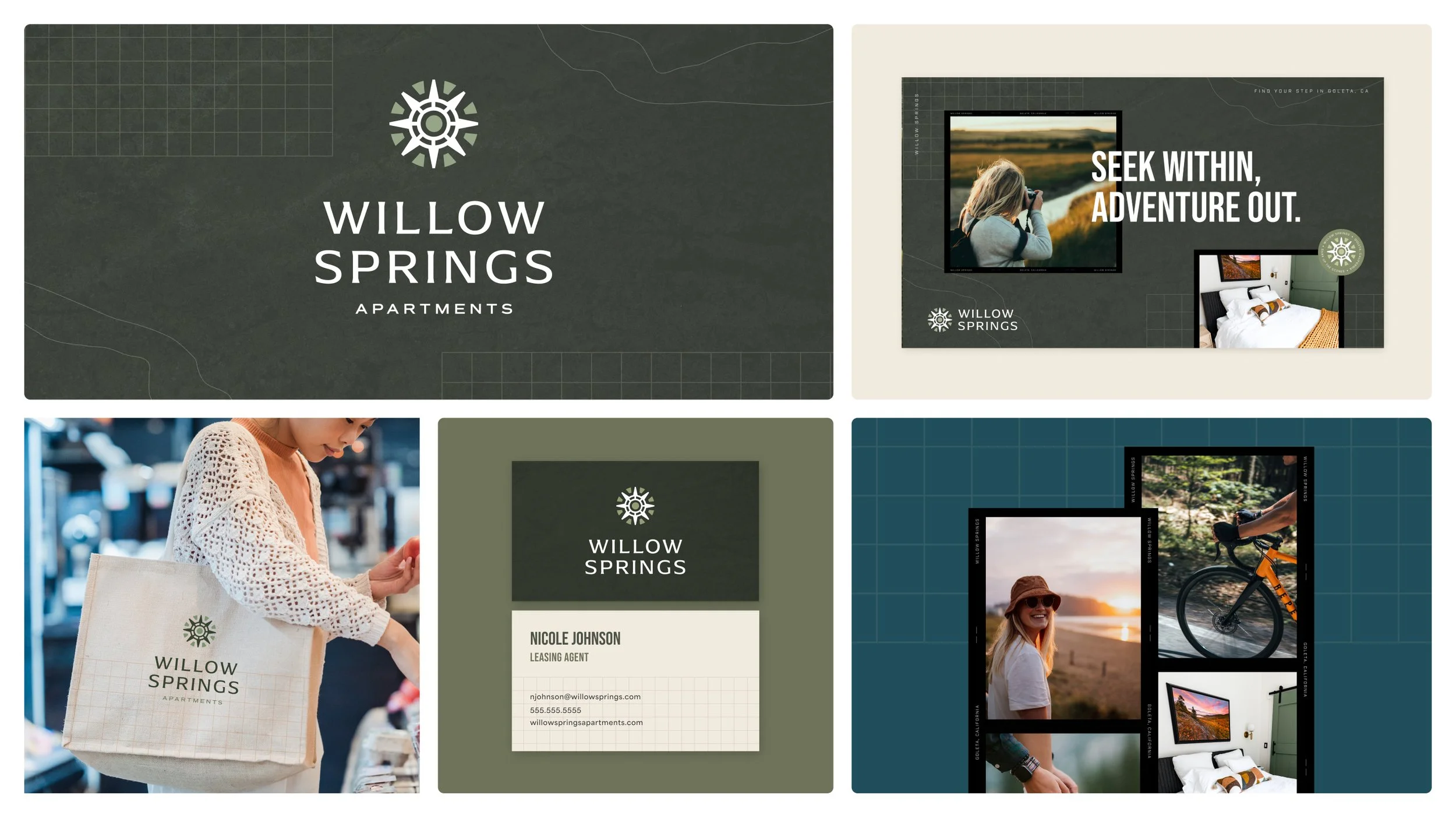
Thirteen Communities, Reimagined with Purpose.

In tandem with their corporate rebrand, we had the pleasure of redesigning and revitalizing the branding for The Towbes Group’s entire portfolio. This comprehensive effort included rebranding 13 communities, each rooted in its own story and defining characteristics. The result, 13 distinct identities that authentically capture the heart of each place.


CLIENT

The Towbes Group

SCOPE

Brand Strategy
Logo
Branding

Hancock Terrace logo with a circular geometric emblem and text reading 'Hancock Terrace, Santa Maria, California'
Logo for Pacific Oaks Apartments featuring stylized text and a wave with a flower.
Logo featuring a stylized bird head in beige and gray with the text 'Patterson Place' below it.
Logo for Cypress Meadows Senior Residences with a floral design element.
Logo for Sumida Gardens featuring green flowers and plants above the text 'SUMIDA GARDENS' in bold letters.
Logo of Oceanwood Apartments with stacked rocks above the text.
Logo for Ralston Courtyards featuring a stylized sun, mountain, and water wave
Logo for Cypress Point featuring the words 'cypress point' with a stylized cypress branch and yellow dot
Logo featuring a stylized sunrise over hills, with the text 'Rancho Franciscan Santa Barbara California' beneath it.
Logo for Knollwood Meadows featuring a green tree illustration and the text 'Knollwood Meadows' in a cursive font.
Encina Meadows logo with a stylized flower icon in gold and green text.
Logo for Siena Santa Maria, California with a stylized 'S' above the text.